Heraldist Grigory Bushkanets: 'New Kazan University Logo Is Readable and Universally Comprehensible'

Head of the Tatarstan Branch of the Russian Union of Heraldists gives his outlook on the new logo soon to be introduced to the public.
- Grigory Moiseevich, what can you «read» from the logos of Kazan University?
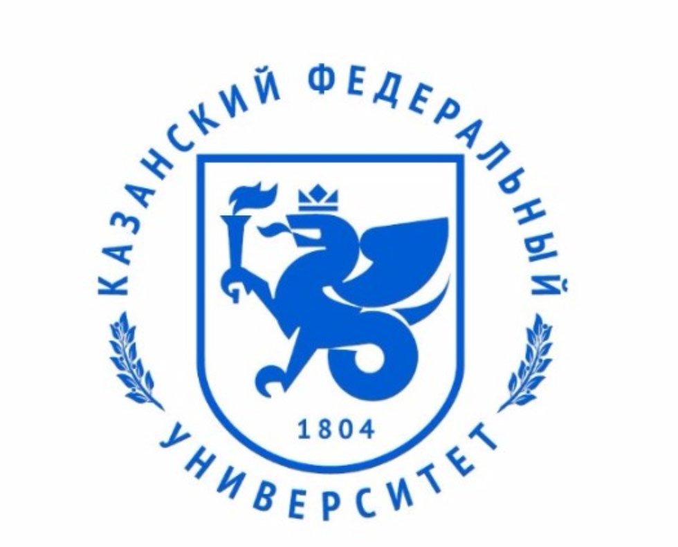
- Depends on which one you mean. The one that was used during the bicentennial celebration in 2004? The one that was later edited to reflect the new status and the new name? Or the one that was presented today, November 12th, to the Academic Council? The first one, I think, emphasizes the University's long history. The third one give more attention to the location – Kazan.
- Why didn't Kazan Imperial University have its own escutcheon?
- Your guess is as good as mine. I can only conjecture that there was no need for it, the University's stamp probably had the Emperor's coat of arms on it. And Alexander I, as it seems, was indifferent towards heraldry. I cannot remember anything significant happening in heraldry during his reign.
- Does the current escutcheon reflect the specific traits of our University?
- First of all we have to remove the word “escutcheon”. The University has never had one. These pictures that we discuss here are more like emblems.
I'll try to explain why.
The official definition of an escutcheon sounds something like this: «Escutcheon – a symbolic image situated inside a heraldic shield, created according to specific rules and approved by a higher authority».
The emblems that you showed only comply with one of the conditions. The 2015 logo is more like an escutcheon, but still not fully so. It also has some serious deviations from the rules.
Now to the specific traits of the University. I think that specifics of any university is exactly the absence of such specifics – if we talk about education programs. The uniqueness of a university can be in its location, history, national peculiarities. Those kinds of specifics are reflected in the University's logos.
I wouldn't even call them logos, by the way, because logo is more a stylized wording. These emblems are different from that.
- What is your opinion of the logo? Isn't it overloaded with details?
- I prefer concise emblems. I think it's better to find one image that would reflect a person, a territory, or an enterprise; in our case – a university. I think that torch-bearing Zilant satisfies this criterion.
- What do the elements mean? Why don't we add a scroll (symbolizing enlightenment) or a flower (symbolizing flourishment)?
- We can add many different things. A scroll, a book, a feather, a mathematical formula, an integral, a punch card… But then we would have to add one symbol for each of the institutes.
I think each of the emblems must be left to their respective institutes. And maybe include the University's emblem into each of them as well. For example, some Russian cities in the 19th century placed their governorates' emblems in the so-called “free subdivision” of the field.
I can summarize that the current 2015 emblem is easily readable. Zilant, a symbol of the University's location, bears a torch. Clear, concise and comprehensible.
- Is that Zilant, anyway? Some think that the «dragon of Kazan» is a Muscovite caricature of Tatars. Or maybe that's a dragon that was slain by St. George?
- That's definitely the Zilant, albeit slightly stylized. The talks about Zilant being the same dragon that was slain by St. George started in 1990s. Since then they have been many times disproven and shown to have absolutely no historical or cultural foundation. This includes the 2005 conference on heraldry in Kazan that was visited by the State Heraldist of Russia Georghy Vilinbakhov.
- Russian heraldry is rooted in the Western European one. Is there any connection with European universities in this new logo?
- I don't think there is the need to look back at the European universities' experience in this case. Yes, Russian heraldry descends from Western European heraldry, but today it quickly absorbs different traditions of Russian ethnicities and territories.
- Can elements from different historical periods coexist in one emblem?
- According to canon contemporary symbols (of approximately the last century) cannot be used in the coats of arms. But symbols from different times can coexist.
- Heraldry is an inalienable part of history. So a heraldist must be professional at what the does, must know history. I strongly suspect there are not so many high-level heraldists in Russia and in the world. For example, how many of them are in Tatarstan?
- I think you can count them with the fingers on your hands. Maybe even one hand.
There has been a resurgence of heraldry in our everyday life during post-Soviet years. You can just walk along the streets of Russian cities to find out that it's true. Heraldry Council under the President of Russia and regional heraldry councils supervise the creation of new flags and coats of arms.
It must also be noted that government entities actively cooperate with heraldry NGOs, especially the Russian Union of Heraldists.


